
JP Graziano's website...
JP Graziano's website...
-
-
-
-
-
JP Graziano's website...
-
Post #1 - January 10th, 2006, 9:00 pmI am a huge fan of JP Graziano's. I haven't been to their website in a while, so I don't know when it was redesigned, but wow, talk about a bad end user experience.
I realize that my BA in Interactive Multimedia makes me a bit critical, but the lack of usability combined with the aesthetic disconnect between the site's slickness and the store's old school feel appears, at least to me, to be a poorly implemented job.
Maybe, it's one of those "I'm a Mac user" things, but the search function just turns up garbage for me...
Here is the site, any thoughts?Authorized time shifting let the genie out of the bottle....
-
-
Post #2 - January 10th, 2006, 9:58 pmEh, seriously, who cares? I don't think they have many retail customers, and their corporate customers probably don't care at all about the quality of the website. So why should they? Heck, I doubt their retail customers care much, either. I certainly wouldn't.
Have you ever seen the website for Freddy's, in Cicero?
http://www.freddyspizza.com
It doens't make me think any less of the place. I'd rather they spend time on the food than the website no one goes to.
-
-
Post #3 - January 10th, 2006, 10:11 pmWell, I was looking for the name of the cheese I bought there this afternoon.
I sadly couldn't find it...
So why should they?
Well, what is the point then...How much cash did they toss for that unusable site? I don't agree with everything Jakob Nielsen says, but this site is sad.
But, since I asked for opinions, thanks for responding Ed...
SteveAuthorized time shifting let the genie out of the bottle....
-
-
Post #4 - January 10th, 2006, 10:24 pmGiven that it's powered by Mambo, an open source CMS, I'd guess a nerdy nephew said to his uncle, "Let me build you a website! I'll make it easy for you to add news, and I'll even host it for you."
So if they paid anything, it probably wasn't much.
Actually, digging a little closer it's hosted on a chicago-based IP owned by JP Graziano itself, via SBC Internet Services. So it's probably hosted on a machine they've got sitting in their office hooked up to their SBC T1 or business-class DSL.
I still blame it on a nerdy nephew or son or cousin or niece or daughter or sister in law.
-
-
Post #5 - January 10th, 2006, 10:31 pmThanks for the input, I bet you are right...
And yep...Freddy's does have a bad site. I rarely get that way, but I trust your taste!
BTW, the paper I wrote, that you found absurd earned me an A today! Which is why I was celebrating with some pot and pan action!
The last of the peameal bacon with some cheese I got from Graziano's stuffed in a chicken breast. Home made gnocchi and green beans....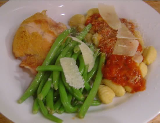 Authorized time shifting let the genie out of the bottle....